Thursday, 11 December 2014

Saturday 6th December - Film Crit

I enjoyed this lesson a great deal for a variety of reasons; firstly, watching the other groups' films was very interesting. Each group took the project in a very different direction: Leroy's group used their knowledge of urban life and conflict to create a down-ending piece in keeping with British realism, Sylwia directed a metaphorical piece on the negative effects of aggression on your social circle, while our group decided to tackle social issues close to members of the group. Each film was unique and engaging, and while none were free of problems they each certainly held up under their own merit.

Our film was generally well-received, and was praised for the acting and storytelling. I was particularly pleased with the reception of the story concept, having worked most in-depth on that front. Criticism fell mainly in two areas; technical issues, of which we had many during filming, some being preventable while others being totally unforeseen, and clarity of filming, some of which can be put down to incomplete planning. Had we thought more closely about some of the rules of film (such as the 30 degree rule and never cutting while filming) while storyboarding and shot planning the issues with imperfect cuts might not have happened. We were also told to think further about story clarity using dialogue - we had initially decided to provide more visual context, but that had to be cut due to length constraints. Using dialogue for this might have alleviated some of the confusion for the audience. Speaking as a group in a crit was a new experience, and while I found it illuminating to hear my colleagues explain some of the decisions made and problems encountered while shooting it meant that not everybody got to speak their mind, due to time constraints. 

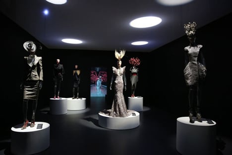
Looking at the design group's fashion project and the prototype clothing was a fascinating eye-opener into the world of fashion development, a subject I have very little experience with. Each person approached the design process from their own angle, varying from conceptual, expressive work, to meticulously planned and crafted ideas, to work based on experience in other media pathways. The huge variety of interests and concepts explored mirrored the diversity of our films, and it was refreshing and exciting to encounter so many new points of view. I particularly enjoyed Alberto and Mohammed's pieces; the former for its ambition and thought-out meaning, and the latter for its inventiveness in drawing from other media which is normally separated fully from fashion.

Tuesday 2nd - Thursday 4th December - Film Editing and Post Production

The penultimate two lessons were devoted to taking the raw footage filmed on Tuesday and refining and condensing it into a successful minute-long film. Joey took it upon himself to do the physical video editing, since he had most experience using similar software, and Seb and I sat alongside him assisting with ideas and suggestions regarding the cuts used and how to make them look as good as possible. I was very new to the experience of editing video, but learnt a lot; there were a couple of harsh reminders of the 30 degree rule within the footage, and some shots that worked better by being cut down or extended more dramatically than seemed plausible. In particular, the opening shot of the magazines on the bed was found to be best when extended, since it gave the audience time to process not only what they were but that they were clearly important. Once that was done, Becky took over to colour correct the film, and while I was initially going to be editing and adding the sound, the recording process had encountered technical errors and the camera-recorded volume was used instead, which didn't require any in-depth editing. 

During this editing process I watched several short films from filminute.com, which is an annual competition for short films no longer than a minute in duration. The overlap with our brief meant that, despite limited thematic connections to our work, many of the films were useful to look at from a technical perspective. I observed where, when and how cuts were made and what effects they produced; long, uncut sequences let the eye wander and begin focusing on the constants in a scene, whereas shorter closeups and cuts increase the pace and tension in a scene. This was useful to feed back into the editing process and help ensure that the film came out as close to our vision as possible.

A still from Grandpa, winner of the People's Choice award at filminute. The centering on the old man clearly shows that he is the focus of the shot, but the fairly long shot, natural lighting and lack of drama show this to be a friendly, low-tension shot.

I also used this time to help another group with their project as an actor, as many class members were unwilling to be in a film. The experience of being directed and following a shot plan was streamlining, but not restrictive - there was room enough in the direction for me to improvise somewhat, and I was glad of the opportunity to do so.

Wednesday, 10 December 2014

Saturday 29th November - Monday 1st December - Film Story Building

This lesson proved pivotal in shaping our film's story, as we showed our plan to Seb and made what we thought were final preparations before filming. Seb liked our concept and moral premise, but also remarked that our story wasn't 'high-concept', in that it didn't exactly create a situation that would be unexpected to a viewer. To remedy this, he suggested that we look at the film from the point of view of a female-to-male transgender person, as issues with trans- and homophobia are often dealt with solely from a male point of view, thanks in part to the stereotypical 'macho culture' objections to such things. Looking at these issues from the point of view of a woman, wishing to be male and struggling to find an accepting social group, is something not addressed often in media and was our chance to make something unique and original.

Sean Penn in Milk, a film documenting the life, work and death of Harvey Milk, the first openly gay person to be elected to a major political position. While the film is candid and respectful in its treatment of homosexuality, for which it should rightly be praised, a predominantly male main cast fails to break away from Hollywood's standard white male leading roles (albeit in this case historical reasons somewhat justify it).

We went back to the drawing board, and during the rest of that lesson and the next Monday our group worked on recreating our obstacle grid, before creating a full storyboard and shot plan detailing the progression of events and how we would structure and record each shot. We decided to have the scene take place at the protagonist's house, having friends arrive early and force a confrontation during which the reveal that the main character was trans would take place. Planning went quite well, I thought, and though I was not able to be present during filming due to prior work commitments I felt confident that the group would be able to record good footage based on our strong planning, and looked forward to seeing the results.

Tuesday 25th - Thursday 27th November - Film Storybuilding

These two lessons were focused on story building, and how to create a successful film from a moral premise that shows your view on how life should be lived. The brief was to create a one-minute 'chase sequence', which was very loosely defined; more importance was placed on story development and meaning than what constituted the nature of a chase in the film. 

After looking at what the basics of a film story are, and how important the story is to the film, we began exploring the concept of moral premises and why they are useful in generating a meaningful film. We were shown some examples, including 'Ruthless ambition leads to community breakdown', which is the basic premise to Kramer vs. Kramer, and then asked to come up with some moral premises ourselves which could be turned into a story. I enjoyed this new approach to storybuilding, as it creates a strong starting point for a story based not on a character or story world, but an ethical issue for the story world to be created upon and for the characters to be metaphors for the various pro- and con- arguments relating to the moral premise at hand.

A still from Kramer vs Kramer, in which Dustin Hoffman's character invests all his time in pursuing his career and ends up neglecting his family, and is forced to learn to be a good parent when his wife leaves him. By expanding on a very simple moral premise, not only is a good, enjoyable story told but the writer's views on family and work come through very strongly.

Using the hero as a vehicle for an author's argument is very common practice in writing, but we learnt in class that there are other, more nuanced ways of using characters to tell a story and express a point. By adapting the ancient debating technique known as dialectic, an author can begin a story giving the hero one extreme point of view, the villain another, and having the hero come to realise the important middleground between those arguments, the format of thesis > antithesis > synthesis is used to not only develop a character as the story progresses but to develop an argument alongside that character. Supporting characters provide new arguments, counterarguments and points of view throughout the story, fleshing out the process of arriving at a good moral premise. Though I knew about dialectic as a process, having studied philosophy before, I had never considered its application in creative writing and am glad to have learnt such a different way of reusing this technique.

Superman, a hero with very clean cut moral objectives, standing for "Truth, Justice and the American Way." Although writers more recently have expanded on and developed his personality, his core concept remains central to the plot of most of his films and comics. Though he is not a good example of a hero as part of dialectic, since his ideals are rarely meaningfully challenged, he represents a powerful storytelling device that has survived for decades in popular culture.

Next, we began individually coming up with ideas, before sharing them in a group to be filmed and edited at a later date. Bearing in mind the concept of the chase, and a passing comment by Seb about the overuse of straight, white males as protagonists, I came up with the idea of a story in which a transgender woman (male to female) has bought a dress and has to conceal it from his friends, while they 'chase' him to discover what he's hiding, and after finding out leave him with just one good friend left. The moral premise here is that being open about yourself leads to discovering true friendship. I suggested this to the group, and after some discussion it was accepted as the story we would work with. We began planning a structure during the lesson, based on the idea of escalating, naturally forming obstacles, and created what we thought was a good foundation to plan a film with. I enjoyed this process of group collaboration and idea sharing, and while my ideas ended up being used first and foremost it was good to be challenged by my classmates, as their input helped both solidify my ideas and added some new ones.

Saturday 22nd November - Sound Design Crit

Disaster struck early, before the crit this Saturday, when my Audition file corrupted while I was backing it up, which meant that I had to rush to recreate it as best I could during the time before the crit. A fortunate combination of good organisation of sound files on my part and the late start due to some students arriving late meant that thankfully I was able to finish the project again successfully, though a little of the nuance of the editing of the final sound was lost, as I had to time to find the exact echo and pitchdown settings I had used. However, I was happy enough with my new sound file to present it for the crit, and was fairly pleased with its overall reception. People liked how I built atmosphere using a small number of effects fading in and out with each other, then building in volume before a sudden cut. It was suggested that I spent more time on the final sound, as the bubble sound I had used had a fairly comedic feel to it that was not intended at all. This crit was very useful to me in that regard; I was happy with the mix of criticism and praise I received and took away some useful information.

Other work that stood out to me was Joey's alternative action scene, from the Digimon movie. I felt he did a great job of replacing the cheesy, generic music used in the original film with a genuine atmosphere of tension and threat, despite his project not being fully finished by the time the crit came around. I also enjoyed some of the design students' work a lot, such as Alberto's bow tie, which was inspired by the celebrity desire for recognition and bespoke, unique accessories. Not only did I like his product design and his prototype, but I also thought he took a risk in terms of attempting to market his product both to the rich elite and the more common consumer, who would be able to purchase off-the-shelf standardised versions of his designs.

Thursday 20th - Friday 21st November - Sound Design contd.

During this time period I recorded some of the sounds I used for my sound piece, such as some water splashing and the wind blowing strongly in the park close to where I live. I then used freesound.org to pick up some sound effects that I could not realistically record with any clarity, such as the sound of the sea and a clear, neat recording of a group of people laughing. Once I had consolidated all of the files I would be using into one project folder, I began working on creating a narrative. Having storyboarded my piece prior to this I felt confident that I had everything I needed, and very few pitfalls actually raised their heads during my work. My only main issue was effectively forming a climax; I could not find a way of making the volume of the wind loud enough to be as oppressive and haunting as I had wanted, and the sound I ended up using to represent the character's last breath was primitive at best. While searching for some ways of ensuring my tense atmosphere came across throughout the rest of my piece, I looked at some horror films to see how they used sound to do the same thing.

The Others, directed by Alejandro AmenĂ¡bar. The film focuses very strongly on portraying isolation, using the weather to great effect and also making use of silence as a method of building tension. I decided to leave some silence before my character's climactic gasp to allow for further built-up tension.

Tuesday 18th November - Sound Design contd.

This lesson ended up being a pivotal lesson for my project, and as part of my career at Ravensbourne as a whole. Having begun working on my jungle sound journey, I took a step back and realised that I hadn't thought much at all about what the piece meant; I had fallen into the same place that I had with photography, where I was making something engaging on a surface level but no deeper than that. I decided to talk to Seb about it, and together we identified that fear was the central theme to my piece, but that my current idea did a poor job of representing how I felt about fear. I began storyboarding things that scared me, both in terms of real-life things and abstract concepts, and settled upon the ideas of loneliness, powerlessness and loss of friendship as themes that were important to me. I decided initially to use a shark attack to represent these emotions, as I am scared of sharks to some degree, but further thought showed me that this was too divorced from most people's idea of fear to have any real, visceral impact. Not only this, but sharks are very quiet creatures, and it would be very difficult to represent one entirely sonically.

Jaws, the film that inspired what little genuine fear of sharks that exists in the modern world, despite them being one of the least dangerous animals to humans statistically. The iconic sound associated with Jaws is the deep, tense double bass music riff, but I felt using a similar technique would be too derivative and also spoil an entirely diegetic  sound piece.

I thus decided to move from the fear of sharks to the fear of water in general, and to drowning, since that is a much more commonplace and realistic fear. I also felt the ocean in general was a good place to explore loneliness and powerlessness, since it is an environment not designed for humans in any way and can be in fact very hostile and dangerous to those who stray too far into its waters. I decided to have my sound journey be that of a person arriving at the beach with a group of friends, becoming separated, then drowning. This let me explore every theme I had mentioned, and in a way I felt would be successful and relateable to an everyday audience.

Tuesday, 9 December 2014

Saturday 15th November - Interim Crit & Audition

The first part of this lesson was devoted to the generation of ideas for our sound project. I began initially exploring a sound journey of abstract directions, ascending (into the sky, space or heaven) and descending (underground, underwater or to hell), but felt no real narrative emerging that I could connect with. I then thought about common soundscapes, and how I could work within them to create a journey. I immediately thought of a jungle soundscape, and after some thought decided to create the journey of a man traversing a jungle before being attacked by a tiger. I felt that the scene would be impactful and exciting to listen to, while still being achievable and not overambitious.

The sound of a tiger roaring, leaping on and chewing an unfortunate traveler would be impactful and clear, even in a purely audio-based format.

We were then introduced to Adobe Audition, the software we were to use to compile and edit our sound pieces. The layout of Audition is similar to AfterEffects in terms of being based around key frames, so my prior experience definitely helped me get to grips with what I was doing. I spent the last part of the lesson familiarising myself further with the software and experimenting with some samples from freesound.org to create a simple atmos track to base my sound journey on.

Thursday 13th November - Sound Design Tech Intro

After learning the importance of sound artistically and the basics of how to utilise it to create a successful piece, we began studying the technology behind recording sound properly. We discussed various microphone types, such as clip-on and boom mics, and the different polar patterns commonly used in mics. After that, we looked at common recording problems, such as clipping or muddy, overly bassy sound, and how to avoid the pitfalls that cause these issues. As someone with little experience in using microphones and other sound technology, this lesson was extremely helpful in assuaging some of my worries about this project and teaching me how to best go about recording sound clearly and effectively.

After this, we spoke about how sound can be manipulated to produce an artistic effect, such as layering sounds on top of each other to create new and different sounds. This was a subject I knew about previously, thanks to my interest in films like Star Wars and Jurassic Park; the dinosaur roars in the latter were created by mixing and overlaying several different animal roars, including lion and elephant sounds. Many lightsabers in Star Wars have unique activation and sustained noises, some of which were created by vibrating springs and vacuums. 

Darth Maul's lightsaber, from The Phantom Menace, makes a distinct hissing sound upon activation. 

The final portion of the lesson was devoted to using the recorders provided to try our hands at recording some sounds of a reasonable quality. I experimented with some impact sounds in various places, recording at various distances, and found that the elevator was the environment with the least background noise - unsurprising, seeing as it was an enclosed space isolated from other people. This exercise was useful in familiarising myself with the equipment we were using, and allowed me to start thinking about what would be feasible to record by hand for a sound journey.

Tuesday 11th November - Sound Design Introduction

The brief for this project was to create a one minute sound journey, soundscape or sound edit for a film piece. We were introduced to the topic by discussing what sound is, conceptually, before exploring how it is used in film and how it affects film in different ways. The important distinction was made between diegetic and non-diegetic sound; that is, sound that comes from within the story world and sound that is added on top of it to add emotion or atmosphere artificially. We were shown a clip of a scene in Blade Runner, in which almost every sound is diegetic, and yet alongside fairly limited visuals an incredibly tense atmosphere is built up to an explosive conclusion.

A still from the scene we watched in class. The sounds present, such as the oppressive whirring of the aircon and the arrhythmic, unsettling beeps from various machines and instruments present in the office create a very powerful atmosphere without resorting to background music to achieve the same effect.

I found this lesson a very useful grounding in the artistic basics behind sound design, and appreciated the time taken to expand on the importance of using organic, diegetic sound creatively and not using background music as an easy way of creating emotion in a piece.

Saturday 8th November - Animation Crit

As mentioned previously, I hadn't finished my piece, which meant that unfortunately I had nothing to present during the crit. However, I felt my attendance was not a wasted exercise, as I still got the chance to observe and discuss the rest of the class's work. Many of the animations proved far more successful and thought-provoking than their original concepts, having been worked on thoroughly and developed over the course of the week. Particular favourites of mine included Emmanuel's comedic animation about stereotyping tall people, which, while not particularly deep, succeeded totally in amusing the audience while still getting its point across. I also enjoyed Jacob's looping brick-into-flower-into-brick animation, which conveyed its message beautifully yet concisely without overstepping itself.


Tuesday 4th November - Thursday 6th November - Animation

These two lessons were spent doing the legwork for my animation, which included redoing my storyboard, designing my characters and story world, creating functional character models and backgrounds and animating everything. Input from Kat was helpful in streamlining my idea, but ultimately my inexperience with Photoshop and AfterEffects meant that I didn't budget my time efficiently enough and I was unable to complete my project in time. 

This project was the first one that I spent a long time using my graphics tablet, and it took a while to get used to such a different style of drawing. Remembering to layer body parts properly, experimenting with different brushes and colouring techniques and making those work in an animated format was a challenge, and though I was not successful I was glad to have the experience and learn about the software I was using along the way.  

Heroman, the final design and model I created in Photoshop. Highly simplified from my original design in order to facilitate animation, I feel he retains enough personality and individuality that he is recognisable and memorable to an audience for the course of a one-minute animation.

Saturday 1st November - Storyboarding and Interim Crit

Storyboarding is an essential part of pre-production for any media, whether animated or otherwise, so I was glad of the chance to hone my abilities in the area and learn to create a communicative yet succinct storyboard. We began by brainstorming concepts and ideas to use, based around the theme of stereotypes and putting a twist on them. I looked back to my Photoshop poster and the Lord of the Sky and Giants concept I have on the backburner and decided initially to try and work with that. With the setting in mind - a pre-medieval village in a grassy valley - I began to consider how the project theme would fit into my story world. Giants are typically villainous, evil characters, eating, attacking or generally antagonising humanity in most portrayals, so I decided to invert the common hero/ villain relationship and have a kindly giant attacked by a 'hero' who saw nothing but a monster.

A still from Attack on Titan, a popular modern interpretation of the typical evil giant versus underdog human story. The historical setting and verdant fields were useful reference points for building my own setting.

Once I had solidified my concept, I began working on my storyboard, which unfortunately I did not finish in time for the crit meeting in the afternoon. However, I had enough to present and talk about, and the response from the class was generally positive. Some useful suggestions were made to help me streamline and finalise my storyboard, which I planned to continue at home and in class on Tuesday.

I enjoyed seeing everyone else's ideas as well, and contributing to the discussion to help improve their work. It was interesting seeing the different approaches people took when coming up with story worlds, and every angle was explored - from the horrific to the comedic to the philosophical. Seeing so many well-thought out concepts was a boost, and some ideas even inspired me to change some of my own work for the better.

Thursday 30th October - Introduction to Aftereffects

Adobe AfterEffects is not a program I was familiar with, and certainly not one I had ever considered as a tool for animation, so I was initially uncertain when we were introduced to the software and shown the ropes. However, after further research I discovered that it was in fact used for the entirety of the animation for Archer, a fantastic television series. 

The cast of Archer, animated entirely in Adobe AfterEffects. The show's visuals are unique, and have been praised by many as innovative and stylish.

To learn the basics of animating with AfterEffects we were assigned to create an animation of our names entering and leaving the screen. Though seemingly basic, this gave us access to many of the essential techniques used in AfterEffects, such as manipulating key frames and rotation around anchor points. I felt fairly secure in this basic grounding and that, with some further study, I would be able to create a successful animation using this software.

Tuesday 28th October - Unwell

Saturday 25th October - Photography Crit


This was the piece I presented at the crit. Initially I felt positive about the image, and several of the class liked it and enjoyed how I had decided to portray a city without altering any of the actual 'buildings' themselves. However, my main learning experiences this crit came from criticisms - my sketchbook work relating to this project was relatively threadbare, with little in the way of documented research or process. Furthermore, though my imagery might be clever, it looked somewhat juvenile, and didn't appear to possess any deeper meaning than being an experiment with Photoshop. My presentation and discussion alleviated those doubts somewhat, but I realised how important process was in making a successful presentation and reassuring an audience or assessor that my work was in fact the product of work, and not merely thrown together without much care or attention.

My other main takeaway from this session was how interesting I found observing and commenting on others' work, especially the work from the design group that we hadn't been exposed to. Listening to other people comment on work was useful in my continued work at keeping myself open minded and taking multiple viewpoints on board before reaching a decision. I look forward to future crits and spending more time analysing and listening to analysis of our artwork.

Wednesday 22nd - Thursday 23rd October - Photography contd.

On Wednesday I went with two classmates into central London to take some more photographs in a different setting relating to my theme. Having thought about being in an urban environment and having that influence my work, I felt that the busy city centre would be a good location to take some photographs that would be relevant to me. However, I ended up not focusing on the people in the city, but on the architecture, statues and other structures I saw around London. I tried to take photos from points of view not commonly thought about, so that I could create unique, personal images that would be perfect for working with later on.


A selection of the photos I took in central London. I focused on finding interesting, abstract shapes and trying to come up with ways of working with them to realise my own worlds and ideas on top of them.

Thursday was spent editing my photos and deciding on a final piece to present on Saturday for the crit. I decided to go back through my photos looking for interesting structures with which I could create a city environment from my own mind. After looking through all of my photos I settled on one of my earliest pieces, and used Photoshop to add in characters and details that cemented the appearance of a city in my mind.


Tuesday 21st October - Photography contd.

This lesson was spent further researching, and I went to look for more art or photography that I could relate to. I began thinking about aspects of my life that were important to me, such as where I lived and what I liked doing, and realised a lot of the way I am comes from the urban environment I grew up in, surrounded by crowds of different people. Though the people in his paintings are not nearly as diverse as the people I grew up around, L.S. Lowry's crowded urban paintings remind me of life growing up in London and the hustle and bustle of the city's busy inhabitants. 

One of L. S. Lowry's iconic matchstick men paintings. The crowded train station is a scene all too familiar to me, and the stylised aesthetic of these paintings is appealing to me in that it represents the simplistic, undetailed way most people view other commuters and passers-by day to day in the city.

Saturday 18th October - Photography Interim Crit

As the the first true interim crit of the year, I wasn't exactly sure what to expect going into this lesson. It turned out to be split into parts - the first section of the lesson was devoted to explanation of the lighting equipment that was brought in, then Othello worked individually with us and in groups to talk about our projects and what we were working on. The explanation of the lighting equipment went well, and I enjoyed experimenting with it in my photography. As resources were fairly limited in the classroom we were assigned, I decided to shoot photos of a classmate posing as I asked them to and see whether or not I could work that photography into my project later.

Some of the photographs I took experimenting with light. I like the glow behind Becky in the first picture and the reflection in her glasses. The second picture is less interesting from a lighting perspective, but I like the composition and had some ideas as to how I could develop it in post for my project.


Afterwards I took some of the photos from the previou
s lesson into Photoshop and began trying out different ways of imposing my vision onto them. As of yet I hadn't thought too deeply about what I wanted my photos to mean, and focused more on visually interesting composition rather than thought-provoking work. This was discussed as the crit went on, and I resolved to think more in-depth about what I wanted to show in my work afterwards.

Two of the photos I chose to edit in Photoshop. The first one was a fairly simple concept, and though it could probably have been developed more I was still learning how to use Photoshop properly and I am happy with the end result as a learning piece. The second photo is a purely visual piece, which each member of the class interpreted in a different way. While I was pleased that it inspired as much discussion as it did, I couldn't find an interpretation I liked and wanted to take forward to personalise effectively.

Thursday 16th October - Photography research and early shooting

To develop my ideas about a personal photography project further I began looking up artists who had created their own worlds with their work, as that was something I intended to explore. I began with M. C. Escher, famous for his surreal physics-bending work that transformed everyday situations and concepts into something entirely his own. 

M. C. Escher's Relativity. No object in the image could not exist in an ordinary world, yet Escher's toying with perspective and gravity creates an image totally divorced from reality.

Though I find Escher's work inspiring and fascinating, I didn't want to pursue the route he takes of stepping away from reality. Rather, I wanted to take reality and shape it to my own end, creating something new within the world rather than a new world entirely. I began taking early photographs with this concept in mind, looking for abstract shapes that I thought could be developed into new ideas in post-production using Photoshop. 


 A selection of the photos I took during this lesson. I tried to set up interesting close-up shots that could be taken further with Photoshop so that I could superimpose my own ideas onto them as I went on. The first picture is reminiscent of Terry Richardson, now that I look back on it - I suspect I was at least somewhat subconsciously influenced by his photography, which goes to show how powerful his work is.

Tuesday 14th October - Introduction to Photography

I am rather inexperienced with photography on any formal level; I took part in a short photography course a few years ago, so I have basic experience with using a DSLR, but nothing beyond that. Fortunately the first lesson of this photography project assumed a zero knowledge base and taught everyone from the ground up. We learnt about the different features in a camera and their functions, such as aperture, ISO and white balance. I was interested to learn more about manipulating how images are captured with a camera, and glad that the time was taken to explain these functions in detail before research began.

After the introduction Othello began showing us different photographers and their styles in order to get us thinking about different approaches to our project. Many people found Terry Richardson's close-up personal photos of celebrities against a white background to be visually striking and interesting; however, I wasn't so interested in taking photos of people. I didn't want the focus of my work to be anyone other than myself, as it was intended to be a personal project that related to ourselves. Thus, I began looking for artists and photographers using the medium to express things about themselves, rather than highlight traits in other people.

Barack Obambo, as photographed by Terry Richardson. His close-up, vibrant images against pure white backgrounds are certainly iconic and memorable, but not what I wanted to focus on.

Tuesday 7th - Saturday 11th October - Essay Planning

This week's lessons were devoted to planning and structuring our essay on virtual exhibitions - Tuesday's focus was introductions, Thursday's the main paragraph body and Saturday the conclusion. I am fairly confident with my essay writing skills from my experiences with A-Level and university writing on my previous course, but the peer review nature of these lessons did enable me to not only learn from others and observe different points of view to my own but to apply myself as an editor and help others achieve their best by talking through and improving their writing with them. I found this a very enjoyable and engaging experience; I enjoy writing, and applying myself fully to the technical and argumentative side of writing is something I rarely do in my own time. This class gave me the opportunity to step back into the academic writing role both as a student and in some aspects as a teacher, which felt good.


Some notes I took during Saturday's class, which gave me some different points of view to consider writing about in my essay.

I spent the majority of my time during Tuesday and Thursday's lessons doing research for my essay, since I felt secure in my knowledge of structure and argument building. I spent some time looking for different virtual galleries, and one of the most striking was Valentino Garavani's virtual museum. Navigated via mouse clicks, the Garavani museum takes the viewer through a literal virtual gallery, composed of 3D computer graphic architecture and 2D images of Garavani's pieces, alongside photography documenting his life and other work. This was the closest example I found to a virtual exhibition in the sense of mimicking life, and I plan to use it in my essay.

One of the 'rooms' in the Valentino Garavani museum. Each mannequin is a 2D image superimposed onto the 3D work. Not a perfect method of displaying three-dimensional dresses but leagues ahead of a simple online image gallery in terms of curating potential.

I also decided to look at some video games as examples of virtual galleries, since they are the premier examples of interactive virtual environments available today. Some games in particular focus especially on their visual aspects, such as FEZ or The Unfinished Swann. Games like these are easy for even the uninitiated to navigate and serve almost the same function as an exhibition, showcasing the prowess and creativity of the artists involved in their creation. Virtual reality technology is also advancing primarily in relation to video games, since the market is large and expanding, and this technology combined with a more developed version of Garavani's museum could spell great things for the future of virtual galleries.


The Unfinished Swan (above) and FEZ (below). Both games experiment with the perception of reality and are focused first and foremost on visual presentation, similarly to most art exhibitions.

Saturday 4th October - Tate Britain

Our visit to the Tate Britain was driven initially by the follow-up task we had to complete, which was to write a short review of one of several predetermined exhibitions. Of personal note were Phylidda Barlow's dock and the Turner Prize Gallery; however, my favourite display was not actually part of the brief, but a long-term showcase of art history sponsored by BP. In particular I enjoyed the more modern section of work from the 1960s and 70s, including such pieces as Hockney's Mr and Mrs Clark and Percy, which I found aesthetically far more enjoyable than many of the other exhibitions we were allowed to work with.

Mr and Mrs Clark and Percy, by David Hockney. The bright colours and well-realised lighting give the piece a very calm, warm look, and the clear yet not hyper-realistic characters do a good job of conveying their appearance in an appealing and compelling style.

For the brief I decided to focus on dock, as I couldn't really connect with any of the work in the Turner Prize exhibit on any meaningful level. dock was more interesting initially purely on a visual level, as the towering structures make an impact the moment one enters the room. Walking around, underneath, through and inbetween each sculpture creates an immense sense of scale, inspiring a feeling of awe in keeping with the expected reaction to large monuments or buildings. However, this feeling is somewhat diluted, intentionally, as closer inspection reveals these towering creations are nothing more than timber, plastic, and other common refuse materials. These are used as a counterpoint and contrast to much of the other highly polished and developed sculptures in the Tate Britain, and refer back to the chaotic, industrial environment brought to mind by the title dock

 The first piece encountered in the dock exhibition. Its sparse nature and spread out construction allows for unique appreciation from various angles unapproachable by traditional sculptures.

I enjoyed the raw, untamed style present in this exhibition, and the jumble of materials and constructions made for interesting viewing that maintained freshness and variety from every angle. In particular I enjoyed a piece shaped (to my mind) like a cresting wave, made from various poles and pieces of driftwood. The sensation of movement and danger created from standing under a still piece was incredible, and unlike any reaction I had experienced from sculpture before. The physical interactivity with which one could climb inside, underneath or around each piece made for unique appreciation for the constructive work that goes into each piece, and while the obstructive nature of the large work meant that navigating the exhibition could be restrictive it also created a sense of being guided by the artist around the architecture of this wasteland city. I found the showing as a whole engaging and thought-provoking, and certainly successful in challenging the form of traditional architecture and the stereotypically neat and refined pieces that make up the majority of the body of this medium.

A view from underneath one of the exhibits. The claustrophobic, oppressive sensation felt being inside the piece was impressive, especially considering how open and full of gaps its construction actually was. Each piece of wood is clearly carefully considered before being placed such that they form a tight-knit lattice that creates a very solid structure without being wasteful with material.

Thursday 2nd October - Exhibition Evaluation

This lesson was devoted to in-depth study of curating - by the end, we were to understand what a curator is and how and why they build up an exhibition. Looking at the variety of macro- and micromanaging roles bestowed on a curator gave me a new appreciation for how difficult and powerful the role actually is; the influence a curator has on how art is shown to the public can have a dramatic effect on how it is viewed by its audience. The layout, colour scheme, lighting and sound in an exhibition each make an impact on the work within it, and unless dealt with appropriately can spell disaster for the work.

After exploring the intricacies of a curator's role we then moved on to discussing what a curator might include or attempt to portray in an exhibition. Many of the answers given were fairly standard or predictable, such as telling the story of a historical event or displaying work from a given place or period of time. However, some of the more abstract answers I hadn't considered before as possible exhibition themes, such as telling the story of a medium and its development, or exploring an emotion. Again, the group discussion really helped me open my mind somewhat and gave me new, valuable perspectives on the topic at hand.

This conversation thread then segued into talking about why a curator would want to tell these stories; the personal or professional motivations they might have which would influence how they organise an exhibition. Subjects brought up included respect for a particular artist and the desire to portray them in a light in line with the curator's perspective on them, or wishing to inspire discussion and action on a controversial, inflammatory or perhaps relatively ignored subject. Going further into depth on the inspiration behind an exhibition, rather than just the art exhibited, was useful for me in terms of aiding my understanding and appreciation of the skill behind curating successfully.

Annnette closed the lesson with a presentation on Isabella Blow, and a recent exhibition curated by Alistair O'Neill entitled ISABELLA BLOW: FASHION GALORE! As well as talking about Blow herself and her influence on fashion, including her relationships with now-renowned designers such as Alexander McQueen, the presentation spent a great deal of time emphasising how the curating of the exhibition portrayed Blow and her career as glamorous, bombastic and eventually tragic. Seemingly small touches such as her perfume being used to scent the catwalk and dim lighting in rooms showcasing dresses she wore each added a layer of meaning to the showing, and combined made it an extremely successful and reverent exploration of Blow's life, career and death. I was fascinated by the level which such minutiae affects an exhibition, even on a subconscious level, and felt that the presentation, while possibly slightly overlong, did an excellent job at illustrating the importance of curating in art.


One of the display rooms in the exhibition containing outfits worn by Isabella Blow. Notice the moody low lighting, representing the sadness felt at her death, broken up by the spotlights highlighting Blow's exhibitionism and shining impact on the fashion world.

Monday, 8 December 2014

Tuesday 30th September - Sketchbook Talk, Presentations, Exhibition Advice

Today we were given a talk on sketchbook use, and how to fill them efficiently and successfully. Some of the information proved very useful, and I will definitely be taking it into account - I was pleasantly surprised to discover that personal work was also allowed in the sketchbook as well as course-related research. This will help me ensure that my work stays up to date and give me some room to explore and show off my personal work.

After that, everyone who didn't get the chance to present previously did so today. As before, I enjoyed seeing into everyone's different interests and learning a bit about pathways I had no experience of, such as fashion.

Next, Annette talked to the class about getting the most out of an exhibition as possible and analysing it successfully, which can be difficult for the inexperienced. I tend to form very strong judgments of exhibitions, so the advice pertaining to asking others for their opinons was helpful; I am often too close-minded about art and should spend more time discussing my thoughts with others in order to form a more well-rounded opinion.

Finally we did an exercise in which we observed groups of objects on a table and wrote down as much as we could remember after they were covered again. I feel I did reasonably well, but more importantly took away the lesson that it is important to make notes while you are looking at an exhibition or piece, since as time passes details begin to fade from your mind.

Wednesday, 3 December 2014

Thursday 25th September - Presentation (Spirited Away & The Binding of Isaac)

In order to further develop our comparative and evaluative skills for our essay, this lesson was devoted to presenting two images from two different media and comparing them to each other. I started with the film Spirited Away (a personal favourite) and decided to use a still from the scene in which the titular character's parents turn into pigs. I liked the contrast between the cartoonish, childish style the film was made in and the unsettling, scary tone of the scene. From there, I started thinking about other media where a similar effect takes place, and I decided to choose a video game, since I enjoy them a lot and am interested in working with them in the future. I settled on a promotional image for The Binding of Isaac, as it shared a similarly childish style, albeit twisted into a more horrifying, grotesque form.


A still from Spirited Away. The child's hand gives us not only a sense of scale, but of perspective - we feel as though we are the child in the scene and understand the horror as her father mutates before her very eyes. The obvious metaphor for the father's greed is accentuated and exaggerated so that even a young viewer (as the film is intended for an audience of all ages) will understand it.


Promotional material for The Binding of Isaac. Again, the small child in the centre gives us a sense of scale and helps communicate the loneliness and terror present in the situation. The juxtaposition between the cute, large-eyed style of the creatures and their actual grotesque forms makes for a very uncomfortable scene, creating a horrific mood perfectly in line with the tone of the game itself.